This tutorial walks you through the general steps about how to build your own Gradio custom component. At the end, you will be able to create a text box component with the glowing background by default.
Before getting started, I want to clarify that Gradio is a full stack web service framework. That means you need some background knowledge about the front-end and back-end in general. Specifically, you need to know about Python and FastAPI for the back-end and JavaScript and Svelte for the front-end.
The workflow of this tutorial
- Install prerequisites
- Create Gradio custom component project
- Running dev mode
- Modifying front-end side
- Conclusion
For Gradio custom component development, you need to install the following four programs.
1. Python 3.8+
Depending on your operating system, the install process could vary. Please follow the official Python installation guide. For macOS user, you can install Python with the following command:
$ brew install python
2. Node.js v16.14+
Depending on your operating system, the install process could vary. Please follow the official Node.js installation guide. For macOS user, you can install Node.js with the following command:
$ curl "https://nodejs.org/dist/latest/$(curl -s https://nodejs.org/dist/latest/ | \
    grep "pkg" | \
    cut -d'"' -f 2)" -o "$HOME/Downloads/node-latest.pkg" && \
    sudo installer -store -pkg "$HOME/Downloads/node-latest.pkg" -target "/"
3. npm 9+
npm should be successfully installed when you install Node.js in the previous step. If the version of npm is lower than 9, simply run the following command to upgrade npm:
$ npm install -g npm
4. Gradio 4.0+
To develope Gradio custom components, you should have Gradio > 4.0+ installed. If your Gradio version is lower than 4.0, run the following command to install 4.0+.
$ pip install -U gradio
The first step to get started with building your custom Gradio component is to create a template using the Gradio CLI:
$ gradio cc create MyGlowingTextbox --template SimpleTextbox
The --template SimpleTextbox option tells Gradio to use the SimpleTextbox component as a starting point for your custom component. This template provides a basic structure for text input components. If you are curious what templates are provided, check them out with gradio cc show CLI.
Now, go inside the created project directory:
$ cd myglowingtextbox
If you navigate the directory inside, you will see the similar directory structure as follow:
myglowingtextbox/
|-- backend/
|   |── myglowingtextbox.py
|
|── demo/
|   |── app.py
|
|── frontend/
|   |── Example.svelte
|   |── Index.svelte
|   |── package.json
|
|── pyproject.toml
Now you have a basic template to start customizing your glowing textbox component. You’ll need to modify the Python code in backend/myglowingtextbox.py to handle the logic and the Svelte code in frontend/Index.svelte to implement the glowing background effect.
To run custom component dev mode, run the following command.
$ gradio cc dev

♻ Launching demo/app.py in reload mode

Watching: 'myglowingtextbox/demo'
'myglowingtextbox/frontend',
'myglowingtextbox'

Backend Server:  http://127.0.0.1:7860

Frontend Server (Go here): http://localhost:7861/
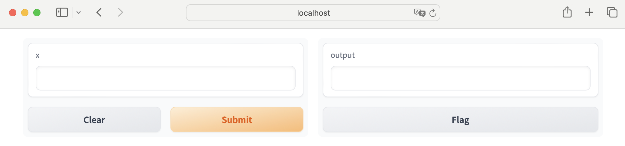
As you see there are two exposed endpoints, Backend Server and Frontend Server. To see the running UI component, open up a web browser, then naviate to the Frontend Server address (http://localhost:7861/). Then you will see the following screen with the two Textboxes:
Gradio’s custom component dev mode actively hot reloads changes. For instance, if you change any codes, the changes will be reflected at real time without refreshing the browser.
The custom component’s look (UI) is defined in frontend/Index.svelte. Specifically, find the following code block:
<label class:container>
    <BlockTitle {show_label} info={undefined}>{label}</BlockTitle>

    <input
        data-testid="textbox"
        type="text"
        class="scroll-hide"
        bind:value
        bind:this={el}
        {placeholder}
        disabled={!interactive}
        dir={rtl ? "rtl" : "ltr"}
        on:keypress={handle_keypress}
    />
</label>
This is where the custom component is defined. To change the style of the component, you don’t need to touch anything else but just class. For instance add glowing-textbox to the class:
<label class:container>
    <BlockTitle {show_label} info={undefined}>{label}</BlockTitle>

    <input
        ...
        class="scroll-hide glowing-textbox"
        ...
    />
</label>
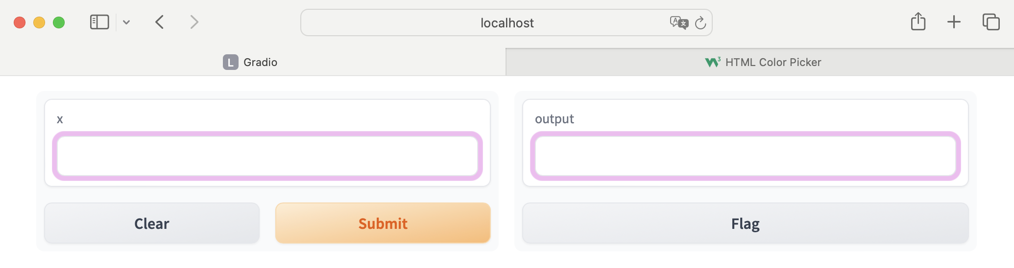
Now, define any CSS styles for the glowing-textbox as you like after the <style> ... </style> section. For the purpose of this tutorial, to add the glowing background on the textbox, you can simply add the following CSS:
.glowing-textbox {
    box-shadow: 0 0 0 5px rgba(204, 0, 204, 0.3);
}
Now, go back to the browser that you just opend in step 4. You will see the glowing background is successfully applied to the textbox component as below:
We have gone through very simple steps to create a Gradio’s custom component. We havn’t touch the back-end side, and this tutorial simply changed the background color of the existing textbox component.
You probably think this is too simple!
However, if you have experiences to customize the look of Gradio application in the past (Gradio < 4.0), this tutorial could save a lot of your time! Of course we could reuse our custom component across various different Gradio applications.
Next
In the next step, I am going to write byte sized tutorials about
- how to publish Gradio custom component on PyPI
- how to use custom component from PyPI
Stay tuned. When they are ready, this page will be updated accordingly as well.